
Perfection in Brown…
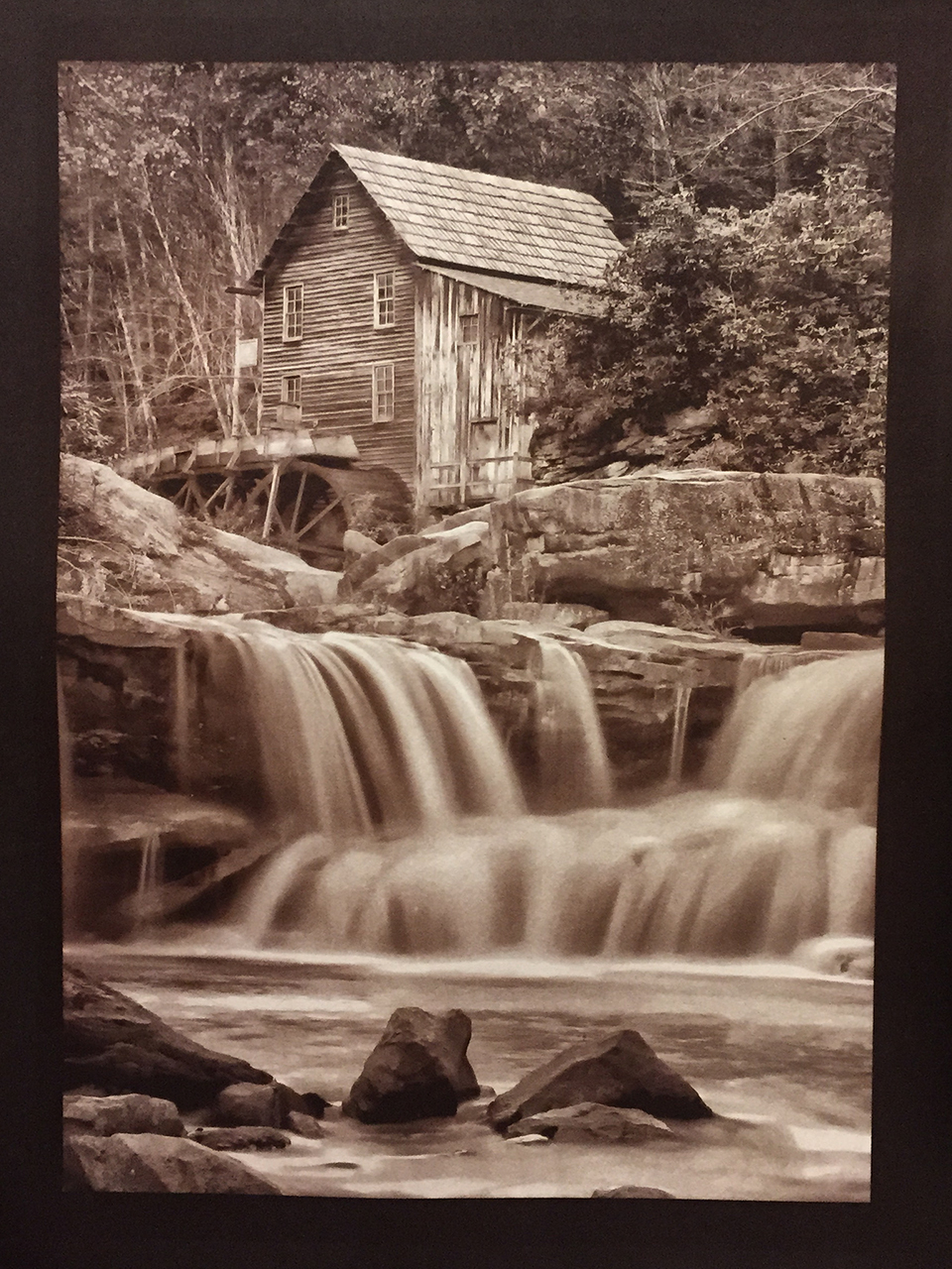
Glade Creek Mill, Van Dyke Brown, Revere Platinum Paper exposed for 5 Min
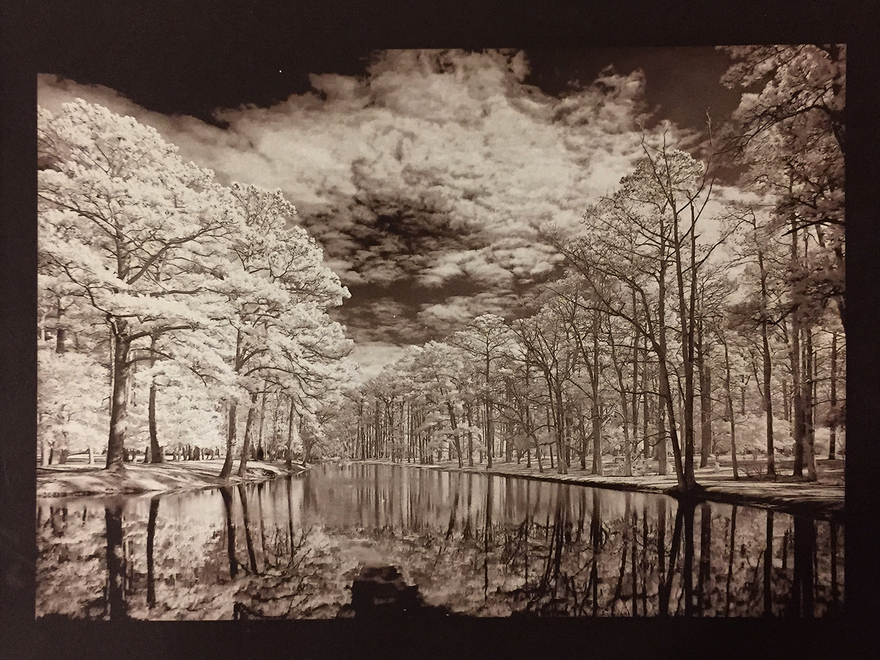
Oak Reflections in Infrared, Van Dyke Brown, Revere Platinum Paper, 3 Min Exposure
After another 2 weeks working on the negative density, I have finally gotten to the point of good negatives, not great yet but I will get there. I have to master the use of UV blocking color in the negative for them to be perfect and that is a project for the future. To date though I have reached perfection using normal B&W negatives.
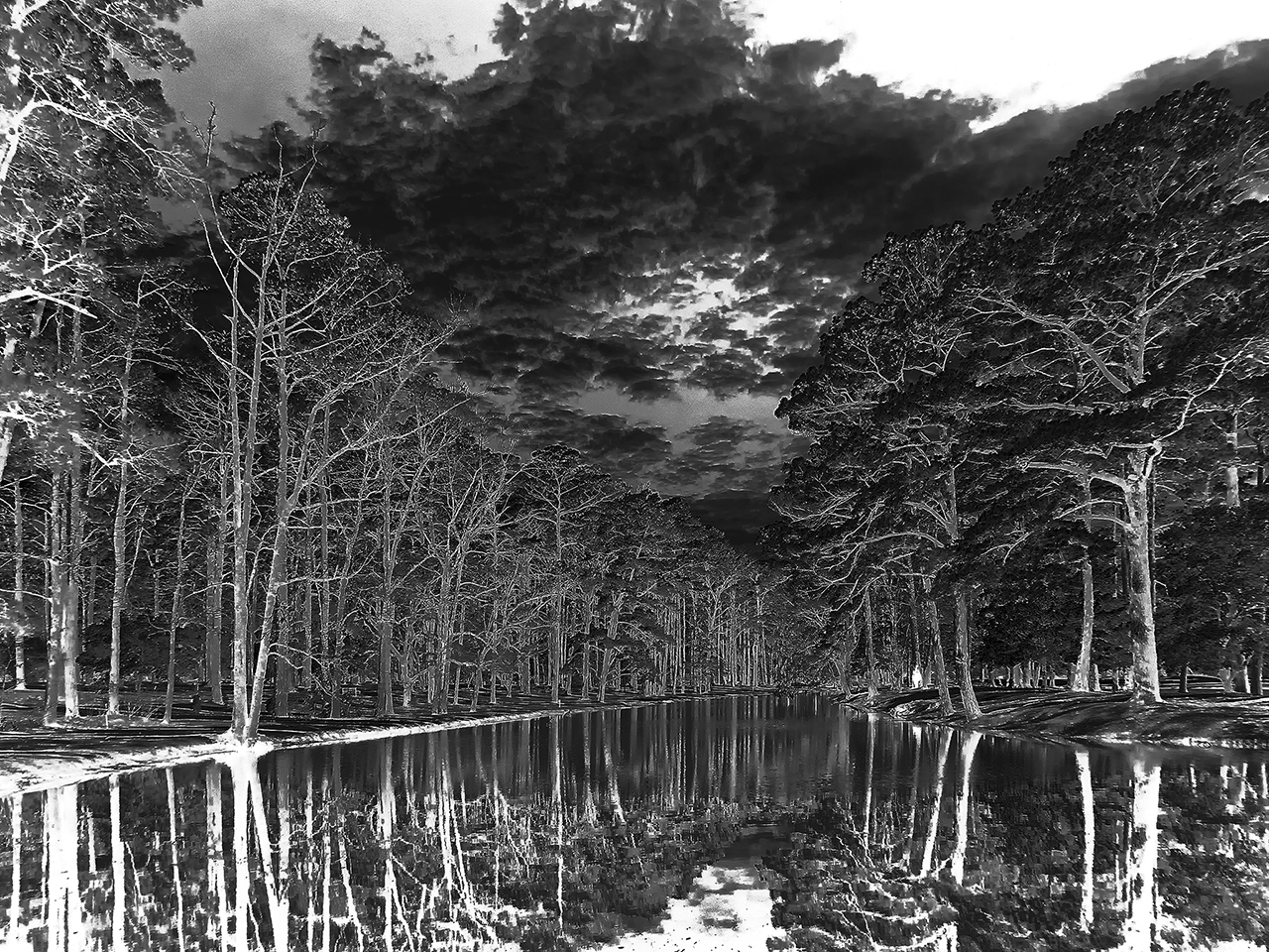
My CORRECTED Digital Negative for the Van Dyke Process
Here is the corrected negative that I used in the image of the Oak trees above. It is much dense and has been corrected for the mid tones as printed in the Van Dyke Brown Process! It has much greater contrast and required only a 3 min exposure in my UV unit.
One thing that you have to remember when making your UV exposures is to place the ink side of your negative down on the paper surface. If you reverse this the picture will be backwards, but more importantly, the UV light will burn the ink surface and ruin both the negative and the print.

B&W Negative for Van Dyke Brown Print exposure calculated for 3 Min.
Compare it to the negative on the right. This negative was used in the previous post here where the image printed much darker and with less mid tone data. Take a close look at the difference between the two negatives, the first has much brighter areas for increased black contrast and more detail in the trees. The difference is amazing and was easily achieved by the process discussed below…
Here is a small copy of the print generated by the 2nd negative from the previous post. Notice how much darker it is and that there is no detail in the mid tones of the image! It only took me a short while to create the Gradient Map from the process that I learned in Peter Mrhar’s book below.

Van Dyke Brown Print, Over Exposed by 2 stops due to the uncorrected negative
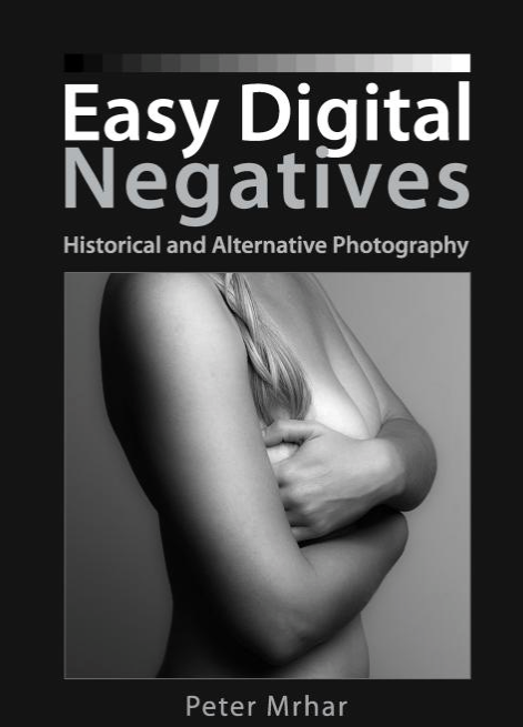
Easy Digital Negatives is another remarkable book by Peter Mrhar
Easy Digital Negatives is another remarkable book by Peter Mrhar that I use in the creation of my negatives. It enables you to easily create Gradient Maps to adjust the mid tone values of your negative tailored to the alternative process that you are printing with! I highly recommend this text over all of the others!
There are several good books on Digital Negatives out there but As I said the is the easiest that I have read and used plus the results of using a Gradient Map over a Custom Curve. I suggest that you purchase several texts and try them in your workflow to see what works best for you!
