Seeing And Working In B&W Part 1a, Basic Compositional Elements
Understanding the B&W BASIC Compositional Elements and the IMPACT that they can have on the viewers!
Honestly, with little exception, most people really love the purity of a finely crafted B&W image. There is something freeing when you stand before one trying desperately to understand why you are drawn to it!
This feeling goes back to our roots. The old masters of film had to WORK at their craft, developing creative habits that allowed few mistakes and the greatest impact with the least amount of failures and setbacks. This was due the the cost and time involved in their work. You have to remember that the cost of photography in the early days was very expensive so they NEEDED to master their craft or be doomed to failure!
Today it is quite different! We have many ways of capturing our images in either true monochrome or in color and then converting it to B&W in post processing. This opens up a new artistic world that was never available in Ansel’s time! Believe me when I say that he would have fully embraced todays technology!
So how do we best achieve these world class monochrome images? Honestly the skills necessary are quite easy to master. The most difficult thing to overcome is opening your eyes and mind to think and see in terms of monochrome images. It will be our task to teach you the necessary tools and thought processes.
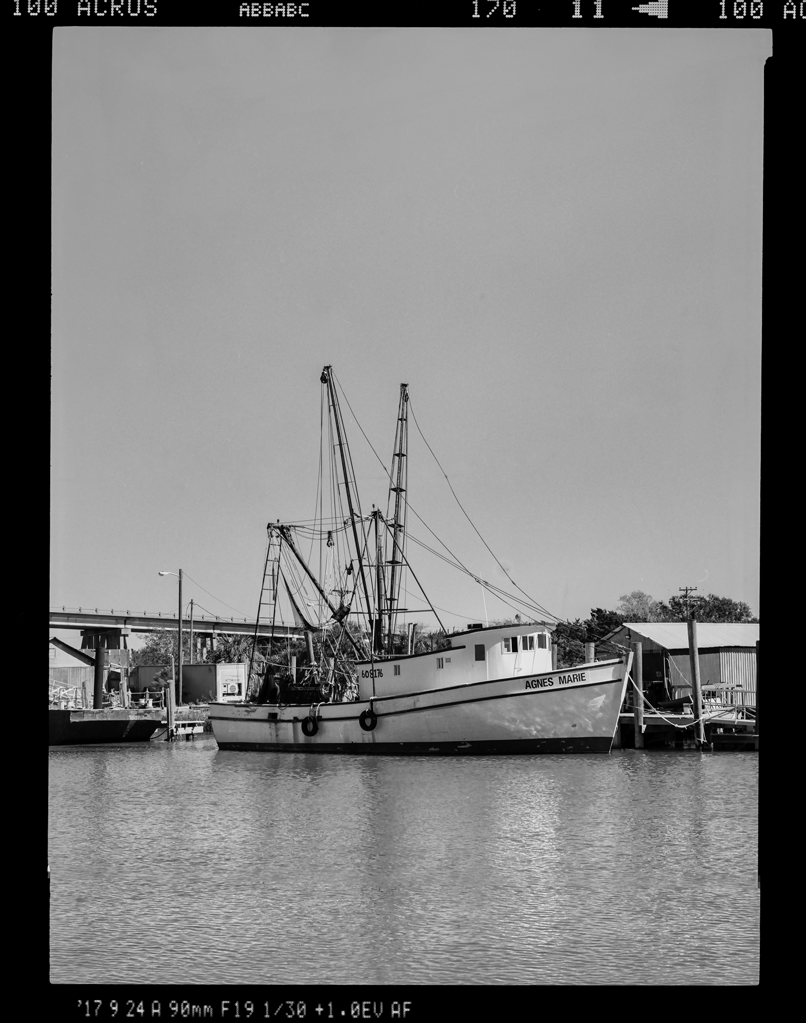
Before I go any further let me tell you that Jamie Konarski Davidson and I are offering a location work shop in the Low Country of South Carolina from December 1 through the 4th. This will be centered in Georgetown SC and be limited to only a few people. For more info please visit:
https://www.newlifephotos.com/photography-workshops/monochrome-photo-workshop/
Ok! Enough of the preliminary stuff and time to get on to the meat of the post!
_______________________________________________________________________

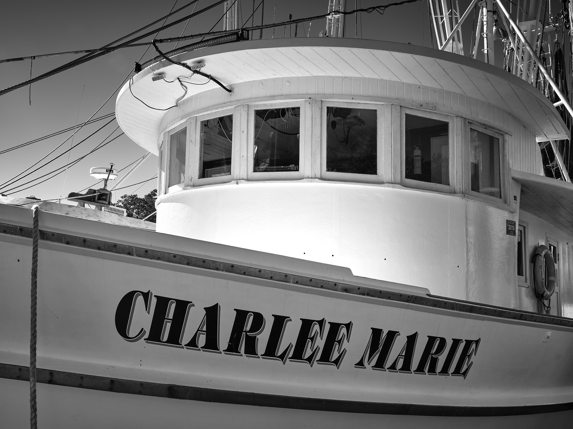
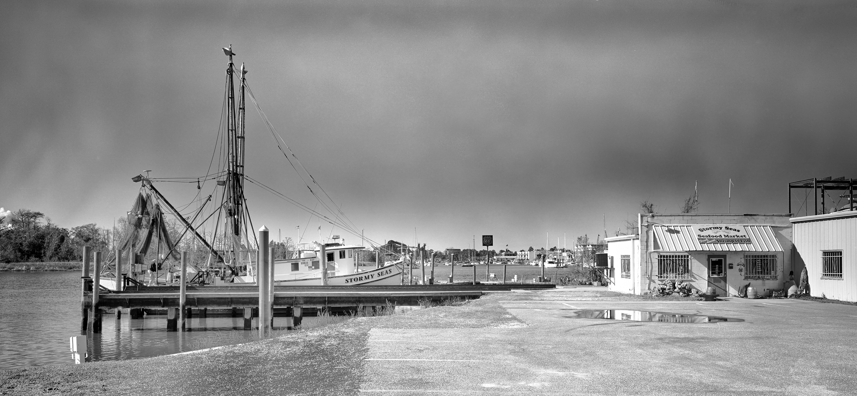
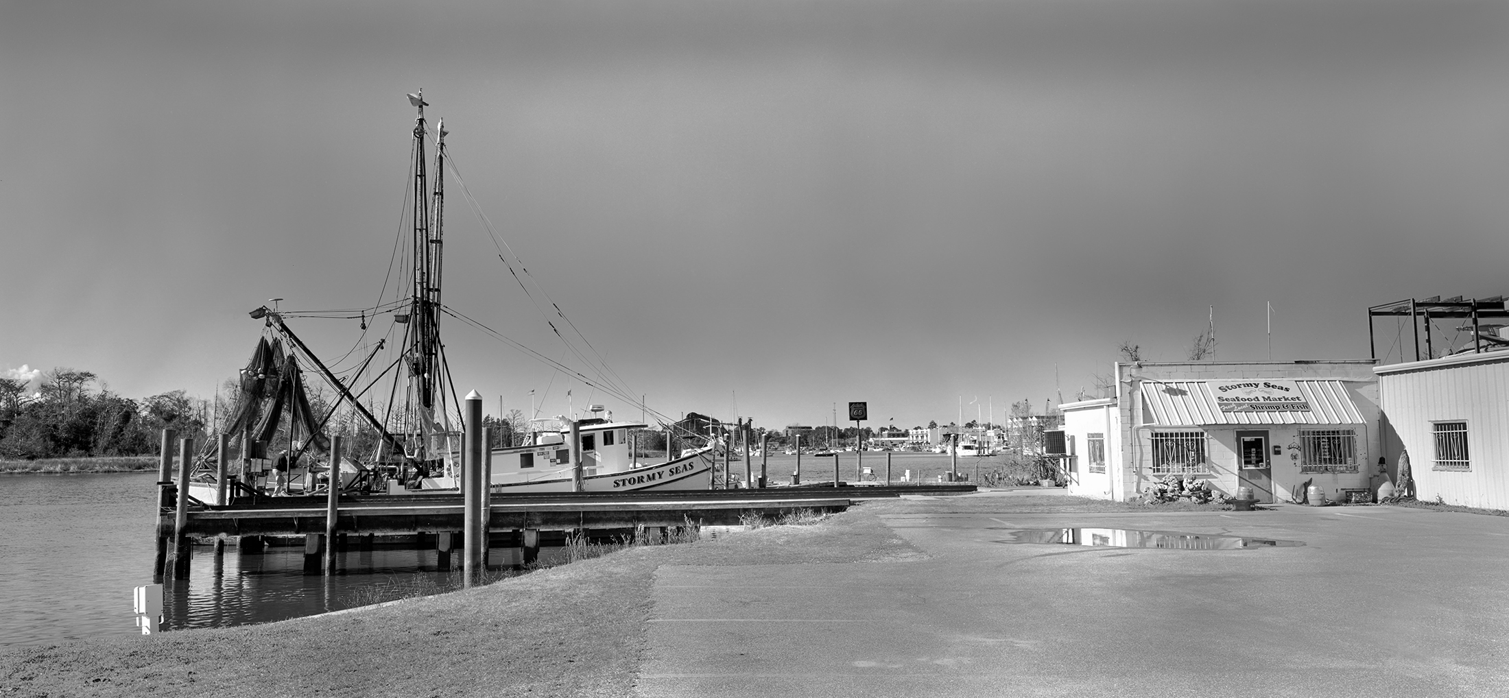
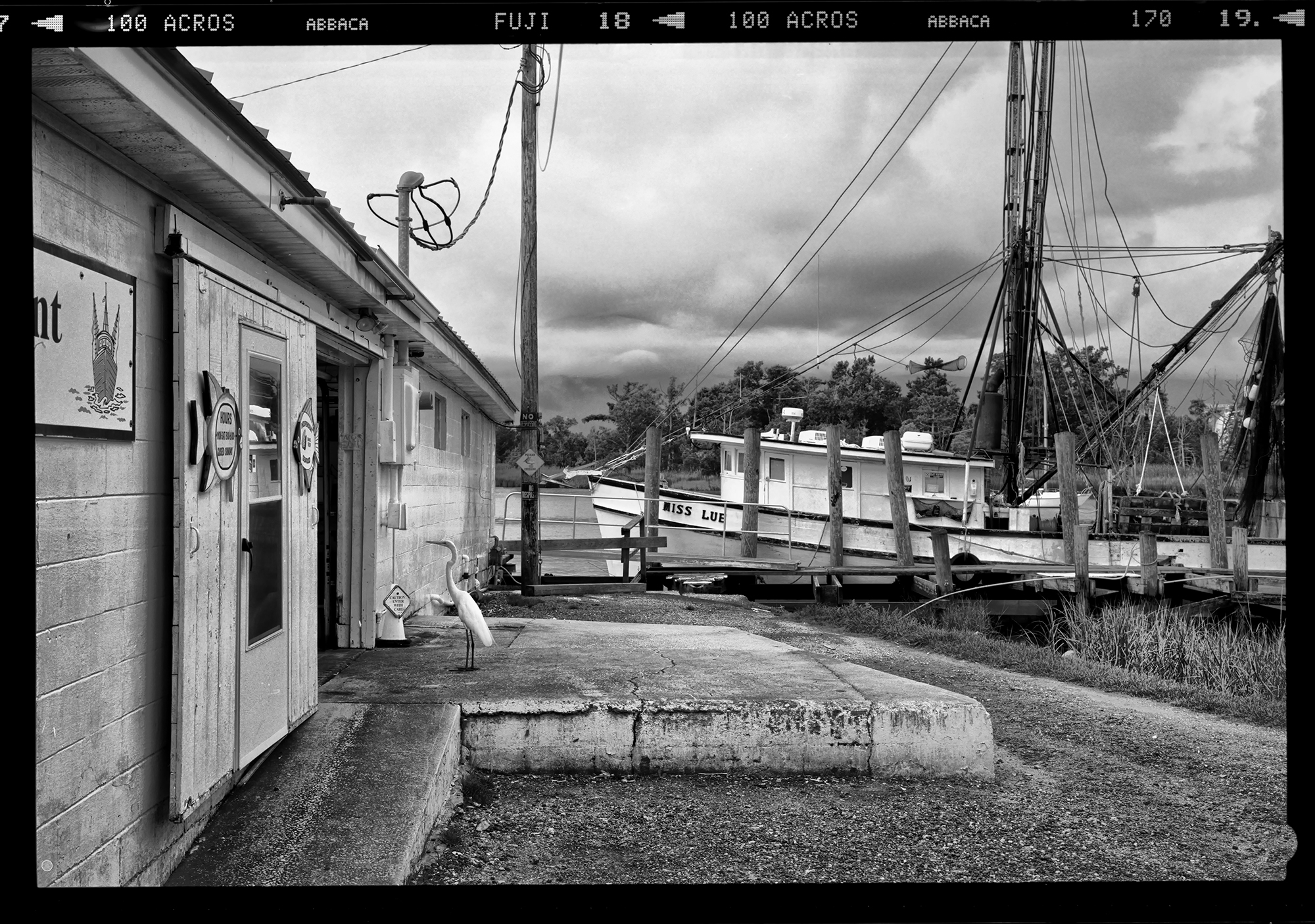
Ok, take a look at the image above of the shrimp boat viewed through the door of their facility in McClellanville SC. (Yes this will be a shooting location during the workshop!)
What do you notice about the image? Hmm, let us consider it!
1. Dark and moody door frame with just a touch of detail. The overall darkness helps frame the boat and keeps your eyes from re-circulating around the frame.
2. Dingy dirty mid ground full of textures.
3. The Shrimper …. Wabi Sabi at its best (study of death and decay)
4. Brightly lit beams of the ceiling leading your eyes to the boat.
5. Stormy sky above the boat. Do you notice the darker area of the sky? These areas are blue sky! They are darkened by the use of real or digital color filters. For film, a glass filter on the lens, for Digital, a software applied color filter.
What do YOU think? Yes it is a dark and dirty image with strange angles and alignments! But the composition tends to draw your eyes to the boat and hold them there! That is a key element of understanding here and our first 2 rules of B&W compositional tools….
Rule 1 – HOLD YOUR VIEWERS EYES ON THE SUBJECT
Rule 2 – Dark and MOODY contrasts are your friend in B&W
_______________________________________________________________________

This image is “The Wheel House Bell”. Here, I was looking to convey a feeling of gloom and uncertainty. The SINGLE compositional element that drew me to the image was the single hand print on the window. It seemed to SCREAM “WHAT IS HAPPENING“. To further my point look at the Bell. The clacker is the letter S which to me says SOUTH as for things going SOUTH for a problem! I can imagine the caption standing at the wheel and seeing something scary approaching as he steadied himself against the glass! I loved the total mystery of the image and even today this is one of my favorite images!
1. Moody Sky with moody clouds. ALWAYS A WINNER!
2. STRONG TEXTURES under the wheelhouse roof.
3. Thought Provoking elements, Bell and Hand Print, attention holders.
So,let’s continue our Compositional rules
Rule 3 – Look for image elements that scream “Curiosity”
Rule 4 – Moody, contrasts sky’s are the secret to a power image!
_______________________________________________________________________
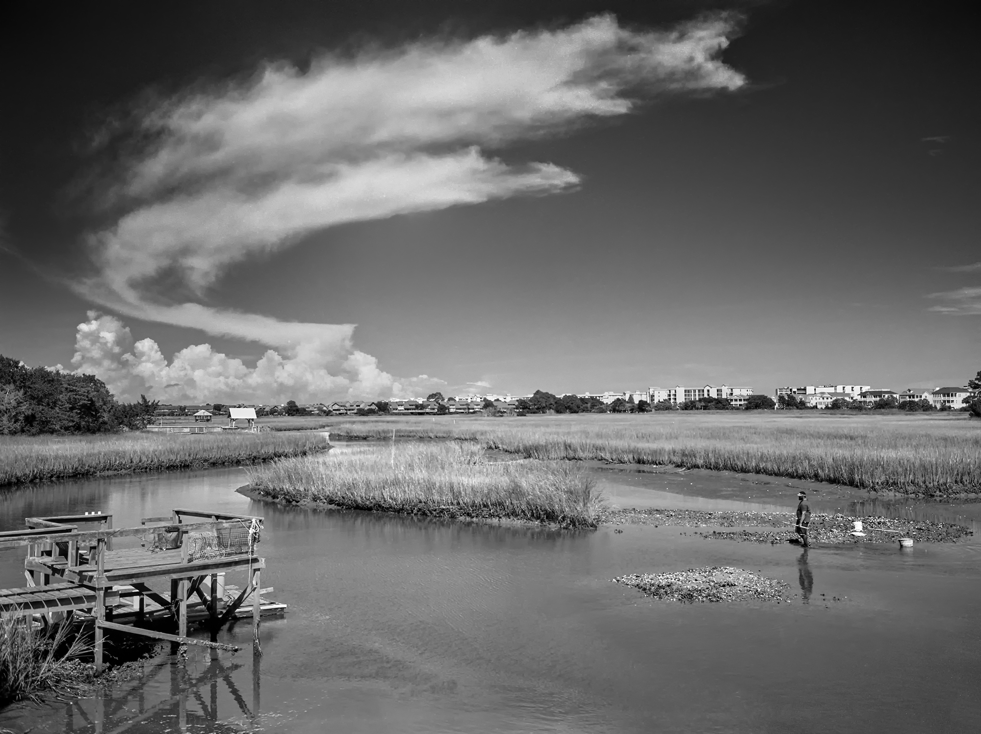
SKYS ARE IMPORTANT!
They can be the key to a successful moody image! Look for skies that are full of clouds with texture. Having a bit of blue showing thru the clouds can add a deep emotional hold upon the viewer.
There are a set of VERY important tools to bring out your skies mood depending upon the camera media you use to capture your image!
Your B&W Image Capture Camera Choices :
B&W Digital – Color Digital – Infrared Color Digital – Infrared B&W Digital
For B&W Digital like the Leica Q2Monochrome and the other Monochrome LEICA CAMERAS PLEASE READ THE SECTION BELOW ON PHYSICAL GLASS B&W FILTERS!
For ALL COLOR DIGITAL CAMERAS:
In Post Processing, you can use software color filters to darken the blue sky for DIGITAL Color CAMERAS ONLY.
In Post processing you can use color filters to darken the blue sky. This is an important tool in your arsenal! The various B&W conversion software will allow you to add a digital color filter. Use the Yellow, Orange or red filters to darken the blues of the sky. Orange will also lighten skin tones.
Digital Software Suggestions For B&W Post Processing
Capture 1 for MAC & Windows
Capture 1 for Ipad (M1 or M2 Processors only) I ESPECIALLY LIKE this software product. It is their newest product and it works with every digital camera product that I have! It has the full B&W conversion facility built into it as well. The biggest positive is that an Ipad is small, light and powerful especially for travel! It will save the images on the Ipad if you wish but will also save them to all of the cloud services! I was a beta tester for this software and after being involved in its development I can tell you that it is an AMAZINGLY POWERFUL image processing package!
Photoshop and Lightroom
Nik Filters for MAC & Windows, A MUST for B&W digital post processing!
SNAPSEED (NIK FILTERS) for Ipad, IPhone and Android (all processor types)
_______________________________________________________________________
Shooting B&W FILM
B&W FILM RULES:
Film Rule 1 – Stay AWAY from films that use the C41 or E6 Developers
Film Rule 2 – Go for a ISO range of 100-400 to avoid grain!
Flim Rule 3 – Keep color contrast lens filters on hand. Yellow, Orange and Red. These will increase the contrast of your blue sky. Yellow will also open up textures and lighten skin tones in people and plants a little. USE THEM!! I keep an ORANGE filter on my film lens all the time.
_______________________________________________________________________
Film Suggestions
Use films that use standard B&W processing, NOT C41 or E6. This way you can do your OWN film processing in your kitchen sink with environmentally friendly and save chemistry!
My Favorite B&W FIlms
Ilford HP5 Plus 400 ISO
Ilford FP4 Plus 125 ISO
Fuji Across 100 ISO – has ZERO Reciprocity failure up to 120s
Kodak TMAX 100
_______________________________________________________________________

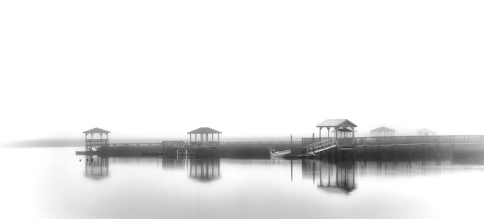
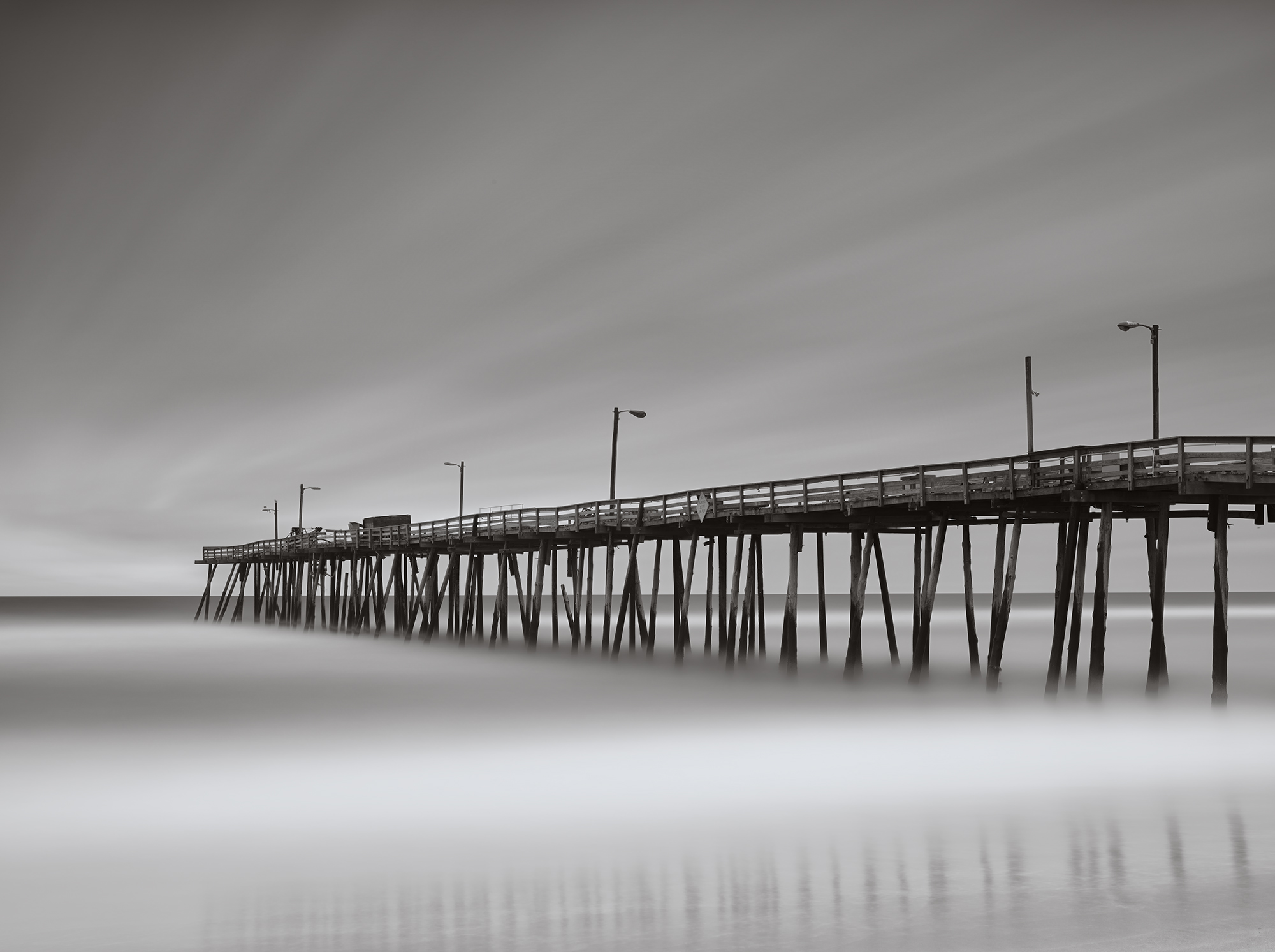
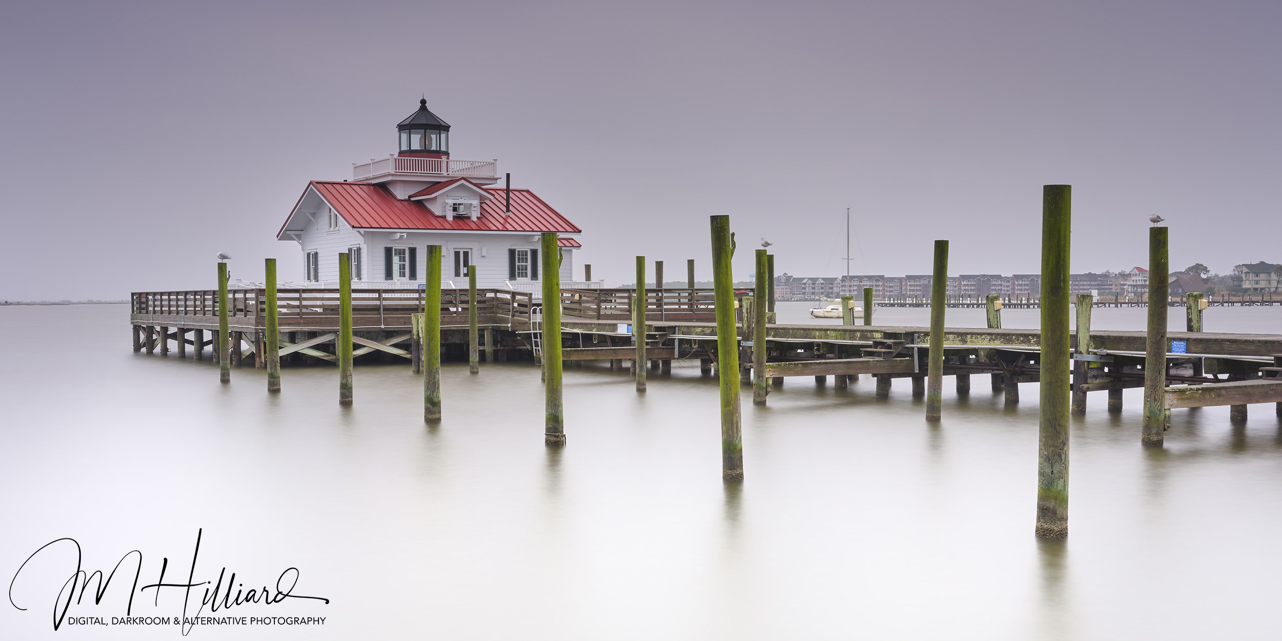
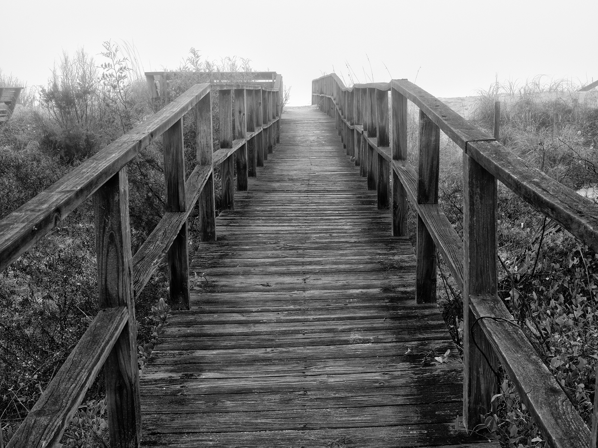
Ok onto one last image. This, like to top image, is a super high key B&W capture. Images like this have a power of their own to stop you in your tracks, grab you by the throat and draw you into the image.
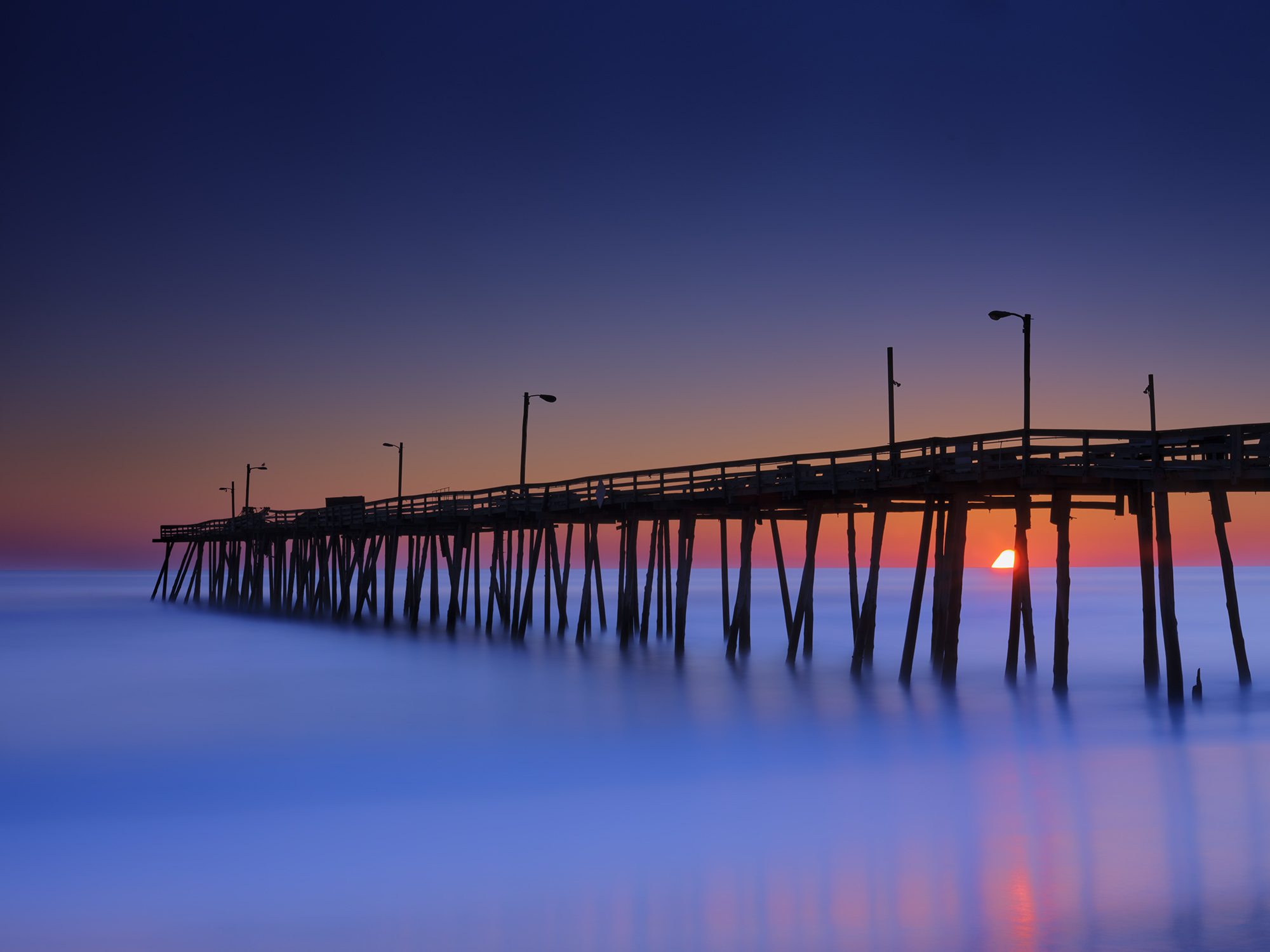
You noticed the very top image of this post. It is another High Key photograph (super bright backgrounds) taken of the Pawleys Marsh in digital. Here you see the Pawleys. Pier (still with the end of the pier) taken on a very foggy morning as a ultra long exposure (I think about 300 seconds on Fuji Across II film.
The most powerful components are the darker groin (breakwater) and pier set against the long exposure smoothing the waves and softening the fog.
What makes this style of image so powerful? It is the contrasts between the darker groin and pier against the stark white contrasting with the smooth surface of the slowed water and the fog of the sky. It becomes almost ghostly and you can easily loose yourself within it.
The key compositional elements in the image:
1. Dark yet almost minimized textures of the pier seems to move forward out to the fog
2. Darker contrast of the groin and its reflection in the ultra smooth surf. This anchors the image in the lower left corner.
3. The ultra bright sky (normally a nuisance and detracting in the image) adds to the ethereal nature of the image
_______________________________________________________________________
Ok, this part of my 4 part series on high impact B&W photography is done. There are a few follow up thoughts that I would like to share with you. Firstly, everything here plus so very much more including advanced post processing instruction will be part of the December workshop here with Jamie and I. There are only a few seats left so please if you are interested do not delay. Here is the link for info:
https://www.newlifephotos.com/photography-workshops/monochrome-photo-workshop/
I will be doing part b of this series next week with a discussion of the darker compositional elements in B&W and start on post processing steps for B&W!

When I look at a well designed B&W image I have to protect my eyes from the amazing intensity of the image!
As always please let me know what you thought of this post. I know that it has been a super long time since my last one, but with covid and health issues I simply lost all motivation for most everything but have climbed out of that depression at last!