Learning to work the scene!


Have a plan to work different compositions with in your scene!

Stormy Seas Side Shot

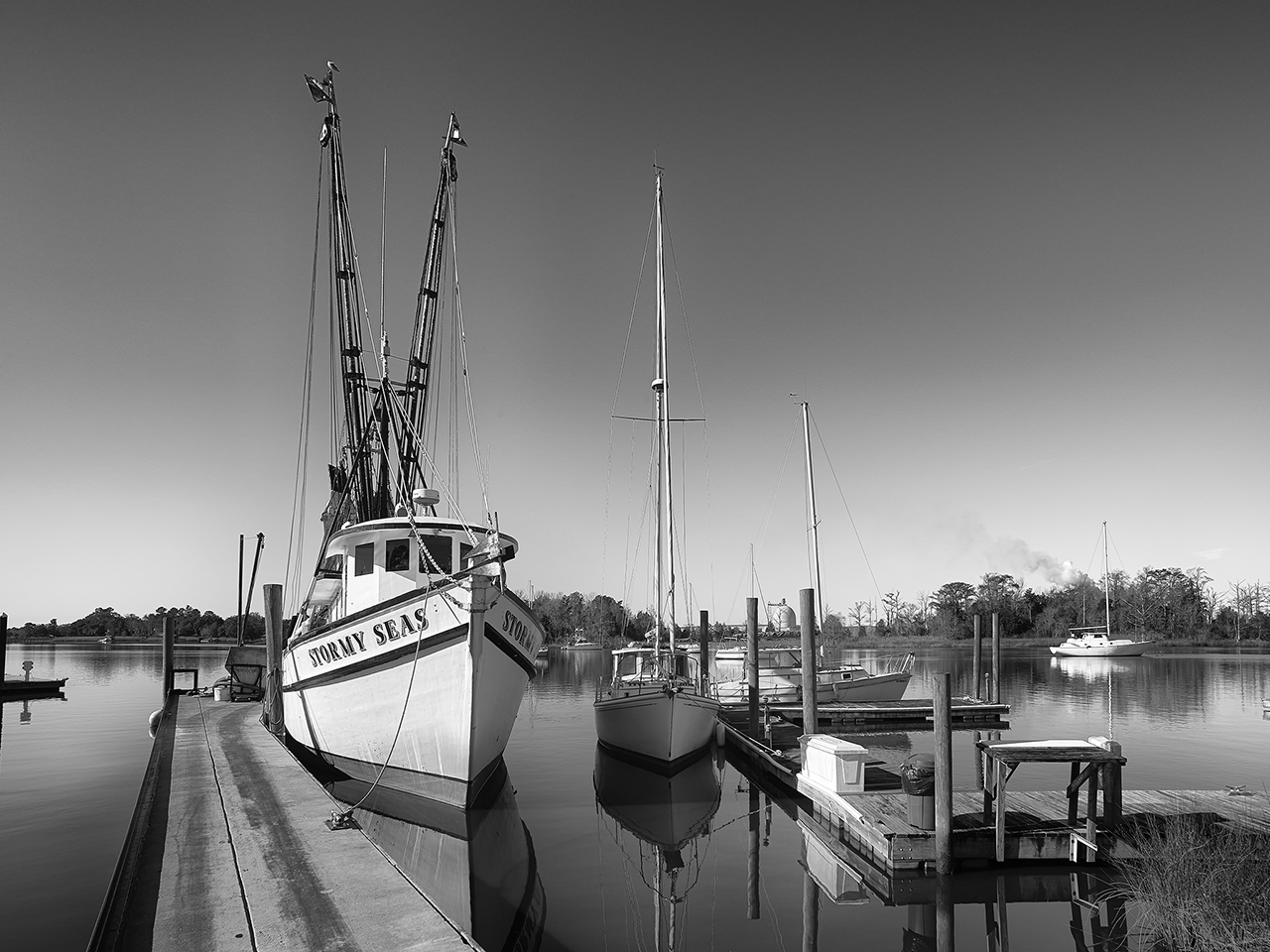
Stormy Seas Side Shot  Sony A7rii with the Sony/Zeiss 24-70 f/4 lens and polarizer.

You know how it is when you walk up to a scene and notice it for the very first time?  Usually we are amazed at what we have discovered!  We setup take the image and walk away congratulating   ourselves as to the amazing luck at finding such a perfect subject!

But wait!  You have all heard that you should work a scene, right?  Just look at all of the cool parts that make up the whole.  I am also sure that you have heard the phrase, “WORK THE SCENE”!  Well that actually means what it says.  Start wide and work in and around getting closer and more details!   When you are as close as you can stand, then work your way back out again!

This is powerful advice…

This is also the secret of all those world class images you see posted or published around the world.  Do you actually think that the professional photographer working and Nat Geo only took the one image?  Really???  They are just like the rest of us, a 30% keep rate and a 90% garbage rate!

So, knowing that it only make sense to take the time to work the scene.  Looking at the top image you see that I could the shrimp boat Stormy Seas with a long liner Charlotte Marie under the strong clouds of tropical storm Bonnie.  The scene is full of mood, color and contrasts.  I was specifically looking to work the shrimper so I did not pay any attention the the long liner.   Here they are a dime a dozen but there are likely a lot of detail shots there also…

Stormy Seas

Stormy Seas, from the bow, Sony A7rii with the Sony/Zeiss 24-70 f/4 lens and polarizer.

So as you can see, I have now walked around to the dock the shrimper is on and take a bow shot composing to keep the other boats, docks and other muck out of the image.  I still set it up to get the great storm clouds.  A much better shot than the first, no?

Stormy Seas

Stormy Seas, closer but  from the bow, Sony A7rii with the Sony/Zeiss 24-70 f/4 lens and polarizer.

Next I move further in, closer to the bow, looking at the painted boat name and the great structure and contrasts hidden the the hull of the boat.  As I stand here I think to myself that having the anchor cut off is a bit distracting but then decide that it adds a hint, or suggesting more out of scene that adds a bit is mystery to the image.  Again, in post, I have added a bit of mood to the clouds also!

Stormy Seas Side Detail

Stormy Seas Side Detail, Sony A7rii with the Sony/Zeiss 24-70 f/4 lens and polarizer.

Now I am walking down the boats side, paying attention to the colors and patterns around the wheel house.  There is a lot here and the images continue to improve. Having the walkway moving up and away from me give a sense of infinity and curiosity as to what is at the bow above!

Stormy Seas Life Ring

Stormy Seas Life Ring, Sony A7rii with the Sony/Zeiss 24-70 f/4 lens and polarizer.

Moving further back towards the boat’s stern (back for you folks who live in Idaho!) I come upon the life ring with assorted fishing accessories hanging from it.  This scene is the most promising so far.  Look at the textures in the wall of the wheel house, the deep rich red tones and the crisp writing of the boats name!  It gives me shivers overtime I look at it!

Stormy Seas Line

Stormy Seas Line, Sony A7rii with the Sony/Zeiss 24-70 f/4 lens and polarizer.

But wait!  Just below the life ring hanging on the gunnels of the boat is a coil of heavily textured rope.  The rusty bold and chipped and rotting rail add so much texture, mood and stories that I am drawn to create an image just of this one detail!

This is exactly what will happen if you take the time to explore your scene totally working inwards getting more and more details as you go!  If the scene is worthy of taking, it demands that you explore it in great depth and detail.  Give it the time to do a good job and document all of it’s glory!

Stormy Seas, side detail, B&W

Stormy Seas, side detail, B&W, Sony A7rii with the Sony/Zeiss 24-70 f/4 lens and polarizer.

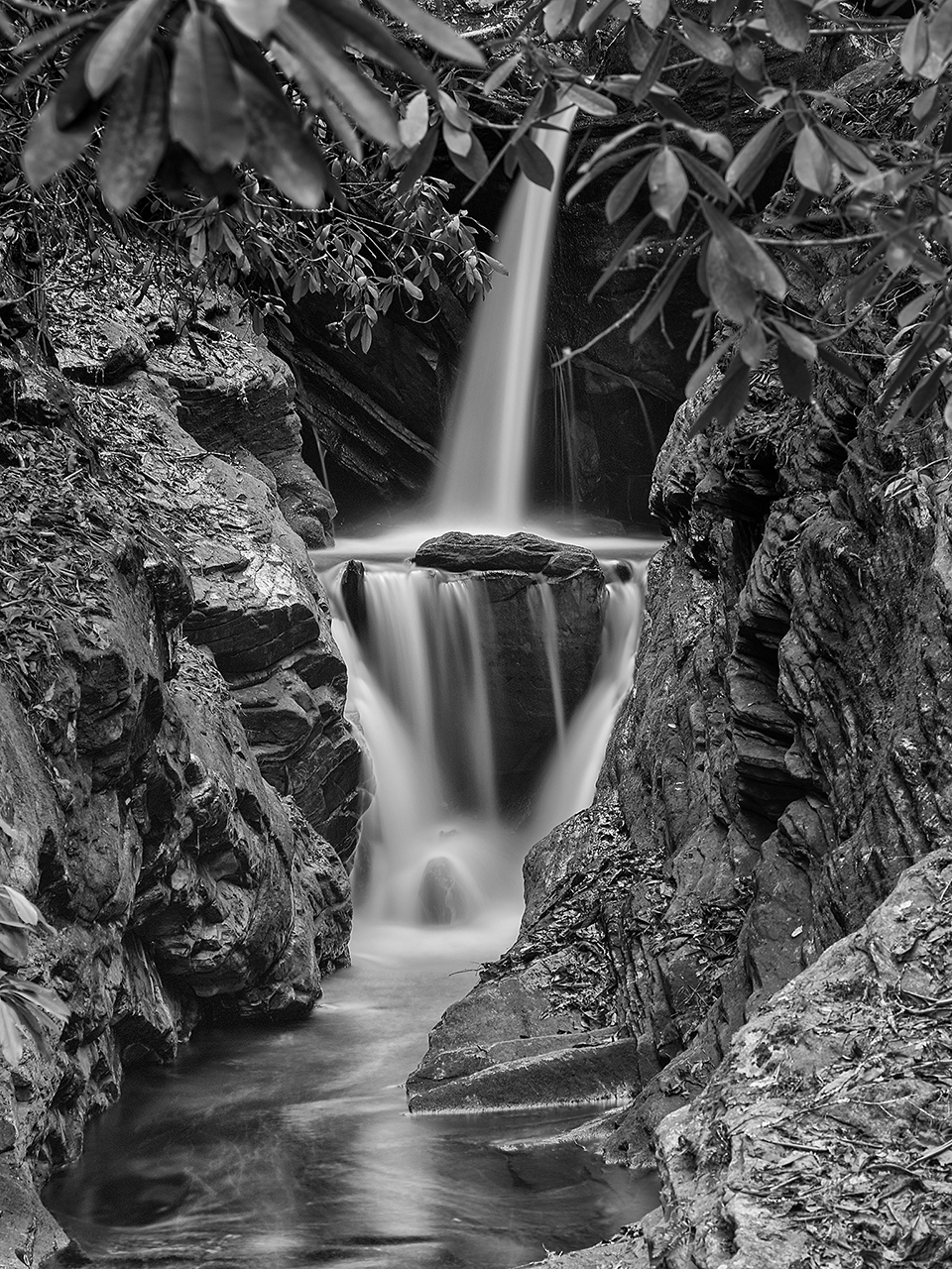
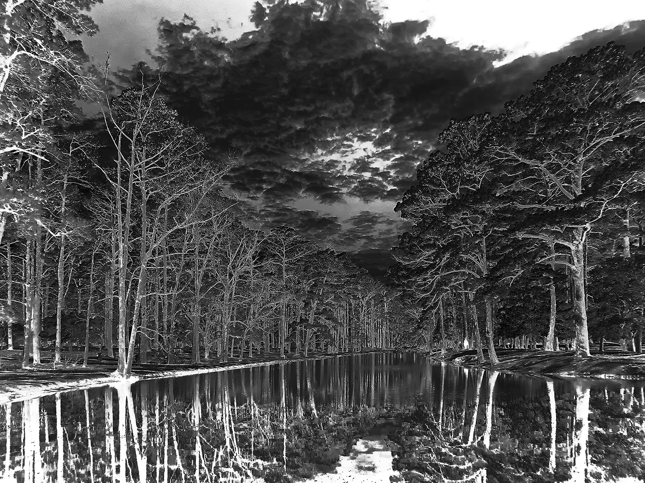
Do not forget to work in B&W as well, each and every image you take might have magic wonder hidden within its detail if you look at in in monochrome!  Look closely at the image above.  The hull has MUCH MORE DETAIL in its structure than the one in color did yet they are the same exposure!  The clouds have more depth.   Monochrome images discard the distractions caused by color… But that is the subject for another post….

Remember, this has NOTHING to do with the type of scene you shoot, nature, landscape or shrimpers, it is all the same!

What do you think?


The Purity Of B&W


Going Home To Momma…

Don’t you have the feeling sometimes of not reaching that creative high so that when you return home you are almost like an empty husk?

Well me too, and sometimes I really need to stretch my artistic legs.  Going out with a Color Camera will just not get the job done and leaves me feeling empty.  Working in Film is a lot better and scratches an itch that I just cannot reach otherwise… But when I am really feeling creatively down and mentally cramped I usually turn to my Leica M Monochrom system.

Duggars Creek Falls, Boone, NC.  Leica M Monochrome

Duggars Creek Falls, Boone, NC. Leica M Monochrome

Working directly in B&W is a soul expanding exercise that will re-inflate my creative side quickly and effectively.  I am the type of photographer who can actually think and see in B&W. Actually generating those images in the field with a capable B&W rangefinder system really is like going home to Momma.  It leaves me with that ohhhh feeling, or is it OHHHHH… Yep, that is the feeling that I am talking about!

First, I LOVE shooting with a rangefinder camera system.   ALL of my cameras are rangefinders except for one little Fuji XT1 that sits in my camera bag rarely used unless I take it out for lightning shots.  I just love the feeling of using a rangefinder!  I am not kidding about the feeling of going home to momma!  They take me back to my early days of photography when a rangefinder was all that I had and used.  They were and still are a nitch camera system.  You generally will not find someone out shooting birds in flight images with one, but that is OK  with me because after 50 years of shooting, I am soooo TIRED OF BIRDS (well except for hummingbirds but I can do those just fine with a rangefinder).

Outer Banks Fishing Pier, 250 second Exposure Leica M Monochrom

Outer Banks Fishing Pier, 250 second Exposure Leica M Monochrom

So what makes me smile about the M Monochrom?  The ease of use, the CRISP release of the shutter, the incredible functionality of the camera and its wide dynamic range!  I love the way it feels in my hands and responds to my control!  I even love the sound of it. It is almost sensual in nature!  Now, couple that with the amazing images that a pure B&W 18 mega pixel sensor with NO Brayer filter and no anti-aliasing filter can create you will be left breathless with the results.  

So for this simple and short post about achieving emotional nirvana, I will keep it to just 2 images that make me feel good. Now that I am creatively re-inspired I can go out again with my color camera (rangefinder of course) and while looking at my scenes in B&W create color images again!

Thank you for stopping by for a visit to the blog…

Continued Work In Van Dyke Brown Alternative Print Process!


Perfection in Brown


Glade Creek Mill, Van Dyke Brown, Revere Platinum Paper exposed for 5 Min

Glade Creek Mill, Van Dyke Brown, Revere Platinum Paper exposed for 5 Min


Oak Reflections in Infrared, Van Dyke Brown, Revere Platinum Paper, 3 Min Exposure

Oak Reflections in Infrared, Van Dyke Brown, Revere Platinum Paper, 3 Min Exposure

After another 2 weeks working on the negative density, I have finally gotten to the point of good negatives, not great yet but I will get there.  I have to master the use of UV blocking color in the negative for them to be perfect and that is a project for the future. To date though I have reached perfection using normal B&W negatives.  

My CORRECTED Digital Negative for the Van Dyke Process

My CORRECTED Digital Negative for the Van Dyke Process

Here is the corrected negative that I used in the image of the Oak trees above.  It is much dense and has been corrected for the mid tones as printed in the Van Dyke Brown Process!  It has much greater contrast and required only a 3 min exposure in my UV unit. 

One thing that you have to remember when making your UV exposures is to place the ink side of your negative down on the paper surface.  If you reverse this the picture will be backwards, but more importantly, the UV light will burn the ink surface and ruin both the negative and the print.

B&W Negative for Van Dyke Brown Print exposure calculated for 3 Min.

B&W Negative for Van Dyke Brown Print exposure calculated for 3 Min.

Compare it to the negative on the right.  This negative was used in the previous post here where the image printed much darker and with less mid tone data.  Take a close look at the difference between the two negatives, the first has much brighter areas for increased black contrast and more detail in the trees. The difference is amazing and was easily achieved by the process discussed below…

Here is a small copy of the print generated by the 2nd negative from the previous post.  Notice how much darker it is and that there is no detail in the mid tones of the image!  It only took me a short while to create the Gradient Map from the process that I learned in Peter Mrhar’s book below.

Van Dyke Brown Print, Over Exposed by 2 stops due to the uncorrected negative

Van Dyke Brown Print, Over Exposed by 2 stops due to the uncorrected negative

Easy Digital Negatives is another remarkable book by Peter Mrhar

Easy Digital Negatives is another remarkable book by Peter Mrhar

Easy Digital Negatives is another remarkable book by Peter Mrhar that I use in the creation of my negatives.  It enables you to easily create Gradient Maps to adjust the mid tone values of your negative tailored to the alternative process that you are printing with!  I highly recommend this text over all of the others!

There are several good books on Digital Negatives out there but As I said the is the easiest that I have read and used plus the results of using a Gradient Map over a Custom Curve.  I suggest that you purchase several texts and try them in your workflow to see what works best for you!

I hope that you enjoyed this short post on the Van Dyke Brown Process.  You can look for more about it in the future!

One Image, One Paragraph…


My favorite image from my visit to Georgetown today…

Stormy Seas… Calm Dock…

Stormy Seas... Calm Dock...

Stormy Seas… Calm Dock…

I had to sit in the Georgetown gallery today. On my way there I stopped at Stormy Seas, my favorite shrimp boat in the area.  I had the Leica M Monochrom with me and the Tri-Elmar 16-18-21 mm lens on it as well as the FRANKEN-VIEWER which enables me to compose the image with ultra-wide lenses on the Monochrom. Did I mention that the Leica M Monochrome is a B&W ONLY camera system? The sky had this amazing gradient across it going from dark gray to bright silvery light on the horizon and the water that you could slide across… Oh My, the water was so perfectly smooth and mirror-like that I stood there stunned with camera in hand just hypnotized at the magic and taking it all in.  But alas, I only had a minute to spare so I took 3 differently composed images at -1ev, f/11 and 1/1500s.  This is the result: a simple, well balanced image, so full of tonality that it is dripping from the bottom all over my feet….

Enjoy while I clean my shoes…